Project Overview
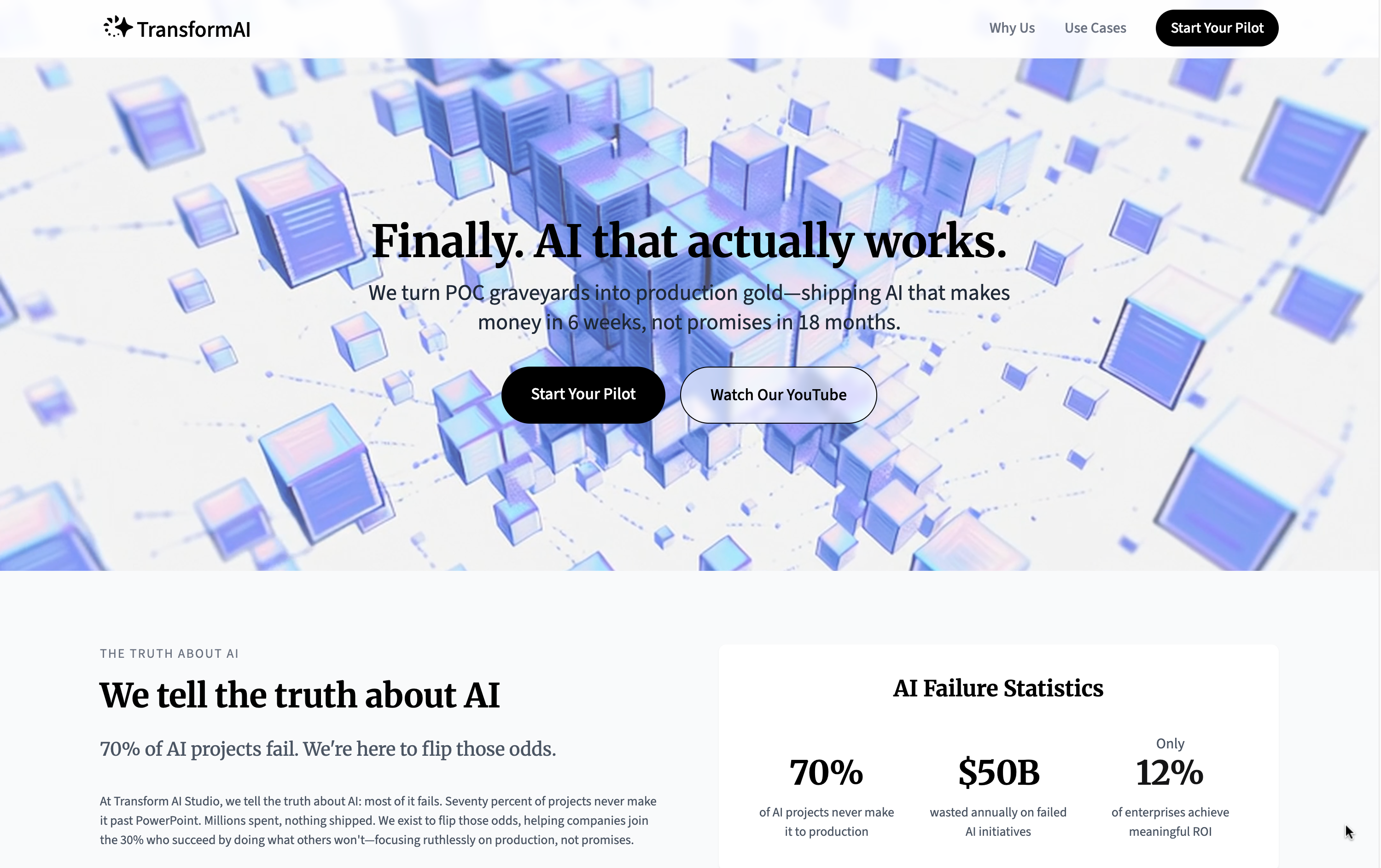
This project is a rapid, end-to-end redesign of a landing page for an AI consultancy startup. The goal was to transform their online presence from unprofessional to trustworthy, ultimately driving client engagement and lead generation.
An Unprofessional First Impression
An innovative AI consultancy startup was struggling to attract clients. Their problem wasn't the quality of their service, but the quality of their digital "front door."
The founders received direct feedback that their landing page felt unprofessional and untrustworthy. As a company that builds bespoke AI solutions, this lack of credibility was a major business obstacle.
My initial audit of the page confirmed several key issues:
1. Confusing Information Hierarchy
Key information was buried, and the user journey was unclear. Calls-to-action (CTAs) were weak and poorly placed.
2. Visual Inconsistency
The use of typography and color was random, lacking a coherent system. The color palette clashed with the company logo and failed to convey a sense of professionalism or tech expertise.
These problems combined to create a user experience that undermined the company's credibility and was costing them potential clients.
Rebuild Trust and Drive Conversions
My mission was clear: Redesign the landing page to establish the company as a credible, professional, and trustworthy leader in the AI space.
The primary business goal was to increase the conversion rate—specifically, to encourage more potential clients to click the "Contact Us" button and initiate a conversation.
To achieve this, I set the following design goals:
Define a new, professional brand identity that reflects "premium" and "tech-savvy."
Create a clear and compelling narrative that guides users toward the primary CTA.
Establish a consistent and polished UI that is both beautiful and intuitive.
A Three-Pronged Design Strategy
Given the tight three-week deadline, I adopted a lean and hands-on approach, covering strategy, design, and development.
1. Redefining the Brand Identity
The foundation of trust is a professional appearance. I started by crafting a new visual identity.
Color Palette
I chose a palette of deep blues and cool grays to project professionalism and stability. For accents, a vibrant light blue signifies technology, while a warm periwinkle color conveys friendliness and care, effectively drawing the user's attention.
Typography
I created a clear hierarchy by pairing the modern serif Merriweather for headlines with the sans-serif Source Sans 3 for body copy. This pairing achieves a polished aesthetic that reinforces the brand's identity while prioritizing user readability.

2. Designing a Cohesive and Engaging UI
With the brand direction set, I focused on the user interface and experience.
Component-Based Design
I designed a set of reusable components (buttons, cards, navigation bars) to ensure visual consistency across the entire page. This not only improved the aesthetic but also made the user experience more predictable and intuitive.
Interactive Elements
I introduced subtle micro-interactions and hover states. These elements make the page feel more dynamic and alive, encouraging users to engage with the content and increasing their time on the site.
3. Ensuring a Pixel-Perfect Implementation
To guarantee that the final product perfectly matched the design vision and to accelerate the launch process, I took a hands-on approach.
Direct Development
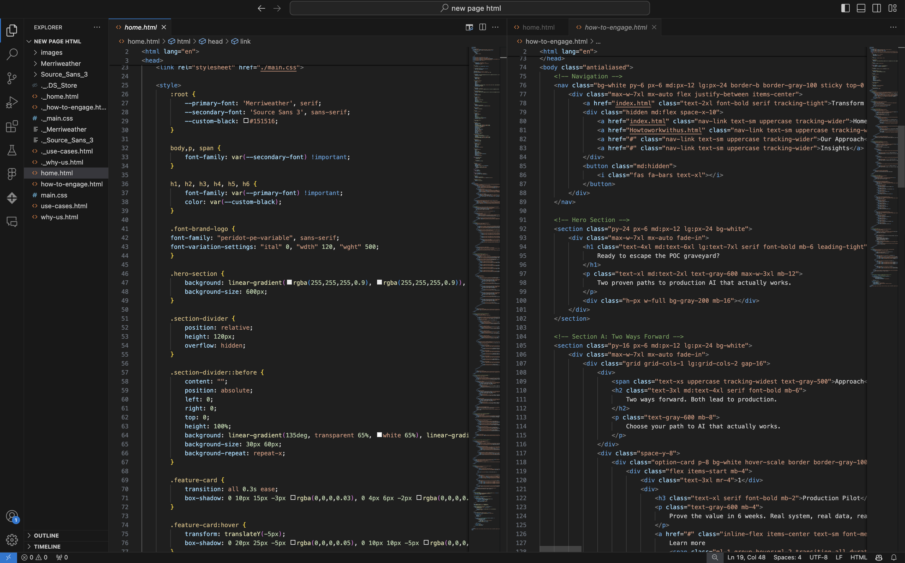
I personally developed the entire front-end of the landing page using HTML, CSS, and JavaScript. This allowed me to ensure every pixel, animation, and responsive breakpoint was implemented exactly as designed, eliminating any potential disconnect between the design mockups and the live site.

A Successful Transformation in Three Weeks
The project was a resounding success, completed from initial audit to final launch in just three weeks.
High Stakeholder Satisfaction
The founders were extremely pleased with the result, stating that the new design finally reflected their company's innovative spirit and professional expertise.
Rapid Launch
Because I delivered fully-functional code, the CTO was able to deploy the new site immediately. This unblocked their marketing and client outreach efforts, allowing them to start promoting their services with confidence.
A Foundation for Growth
The new brand identity and component-based design provided a scalable foundation for the company's future marketing materials and website expansions.
