
Project Overview
Oscr AI is an AI-powered writing assistant that enables users to generate insightful LinkedIn or blog posts using their own curated sources, such as articles and research papers. Following its initial launch, a growing user base provided valuable feedback, highlighting the need for new features and an improved user experience. As the UX Design Intern, I was tasked with redesigning the website to address user needs, define new functionalities, and enhance the overall user interface.
The Challenge
How can we evolve Oscr AI from a basic tool into a comprehensive, one-stop platform that empowers industry influencers to efficiently research, create, and publish high-quality content, all within a single, intuitive workflow?
Discovery & Research
To deeply understand the problem space and user needs, I employed a multi-faceted research approach:
User Feedback Analysis
I analyzed user feedback from emails. By reading through these conversations, I was able to identify pain points, understand the context behind user requests, and translate these qualitative insights into actionable feature proposals.
Remote User Interviews & Usability Testing
I conducted remote interviews with users. By asking them to share their screens and walk me through their process, I observed their natural interactions with the platform.
Stakeholder Interview
I initiated the project by interviewing the founder, who is also a power user of Oscr AI. This helped clarify the product vision, business goals, and her expectations for the redesign.
Defining the Problem Scope
Based on the research findings, I categorized the problems into a three-tiered framework to guide the design strategy.
Tier 1: The Core Value
Goal: Help users quickly produce professional, timely, and accurate industry insights. This is the fundamental job-to-be-done for our target users, who are primarily industry influencers.
Tier 2: The Information Architecture
Goal: Establish a seamless, end-to-end workflow within Oscr AI. The new structure should guide users from initial research and data collection to final content generation and publishing, creating a true one-stop solution.
Tier 3: The UI & Workflow Optimization
Goal: Refine the user experience at the page level. This involves improving key workflows such as the search engine, knowledge base management, and the post-creation process to be more intuitive and efficient.
Design Execution & Solutions
Tier 1 Solution: Enhancing Core Value
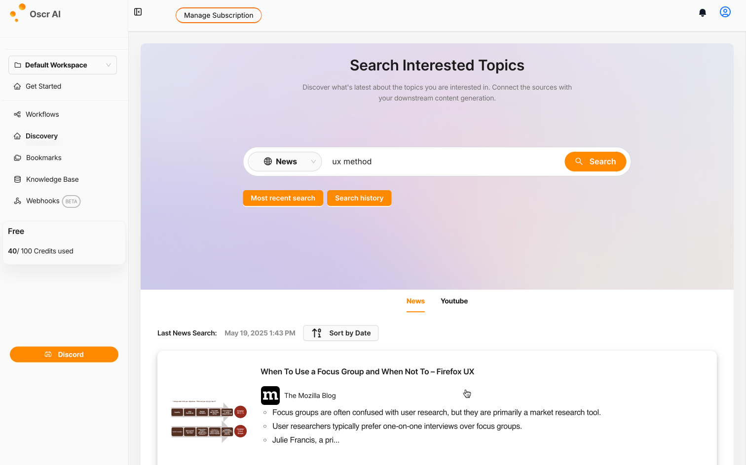
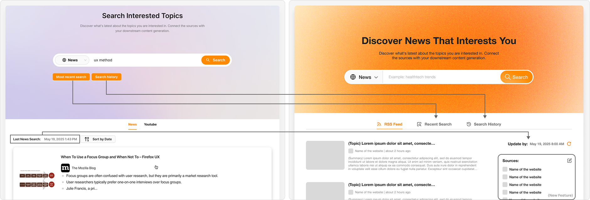
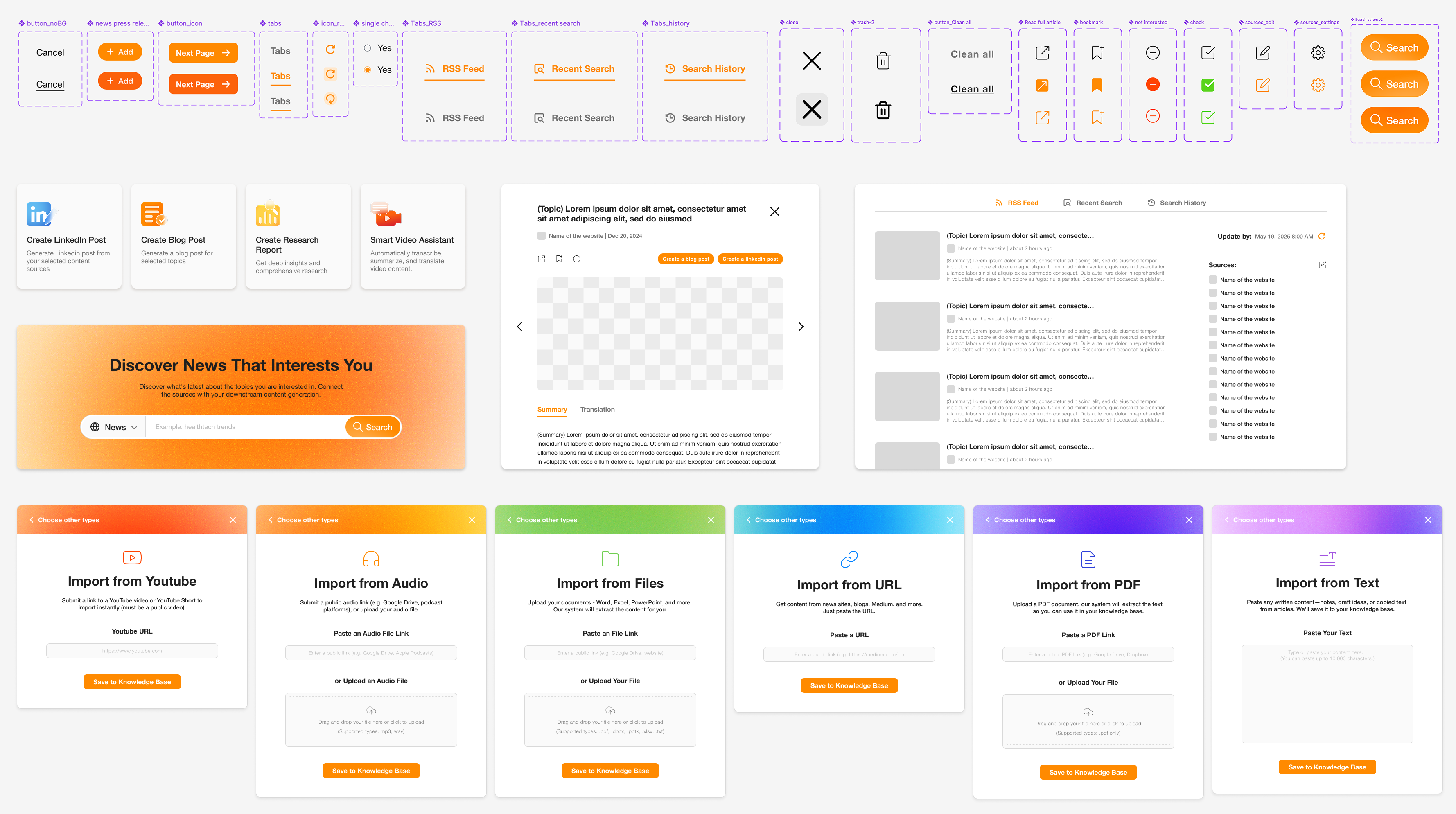
To help users access the latest and most relevant information, I redesigned the Discovery and Knowledge Base pages.
Design Goal
Introduce an RSS Feed management feature.
Challenge
Reorganize the information layout to accommodate the new feature without overwhelming the user.
UX Strategy
- Enable one-click access to the latest articles from their feeds.
- Allow users to quickly add, edit, and manage their RSS feed sources.
- Implement a feature to select multiple articles to use as sources for a new post.
Tier 2 Solution: A New, Streamlined Architecture
I restructured the website's Information Architecture (IA) to reflect the user's natural workflow.
Design Goal
Create an end-to-end service that reduces operational steps and accelerates the content creation process.
Challenge
Introduce a new site structure that aligns with the complete user flow while respecting existing user habits to minimize friction.
UX Strategy
- Clearly communicate the platform's capabilities to first-time users upon arrival.
- Use clear navigation tabs to represent each stage of the user flow, while keeping the most-used features accessible on the main page for power users.
- Relocate secondary information to simplify the interface and create a more focused and intuitive experience.
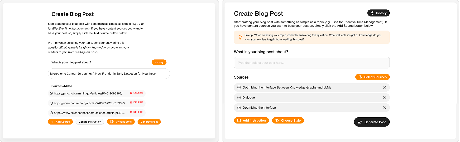
Tier 3 Solution: Intuitive and Seamless UI
I focused on optimizing the UI and interaction design on key pages, such as the Search Results and Create Blog Post pages.
Design Goal
Make the UI and layout more intuitive and seamless.
Challenge
Clearly differentiate between required and optional features, ensuring users are aware of all functionalities without feeling overwhelmed.
UX Strategy
- Establish a clear visual hierarchy using layout, typography (size, weight), and color.
- Place mandatory actions on the main interface and house optional features within clearly labeled buttons or menus.
- Redesign icons to be more intuitive and universally understandable.
Outcome & Impact
The final redesign successfully transformed Oscr AI into a more powerful and user-friendly platform. By restructuring the information architecture and refining key features based on user research, we enhanced the overall usability and aesthetic appeal of the website. The new, streamlined workflow significantly reduced the time and effort required for users to create professional, knowledge-based content.
Reflection & Learnings
This project was a valuable lesson in balancing user needs with business constraints in a fast-paced environment.
Balancing Speed and Process
With a tight deadline for launching new features, the UI design and user need definition phases often ran in parallel. This taught me to be agile and make informed design decisions quickly.
Designing for the Future
We knew users wanted an "auto-update" feature for articles, but it was technically complex and deferred to a later release. I proactively designed the layout to accommodate this future functionality, ensuring that it could be integrated smoothly without requiring a major redesign.
Next Steps
If given more time, I would follow up with post-launch user feedback and analytics to validate the long-term impact of the design changes and gather insights for future iterations.