PRIS: Elevating Usability and Workflow for Government Services
Year
'22
Client
Ministry of Agriculture, Government Agency of Taiwan
Service
User Research, Stakeholder Mapping, Information Architecture, Usability Testing
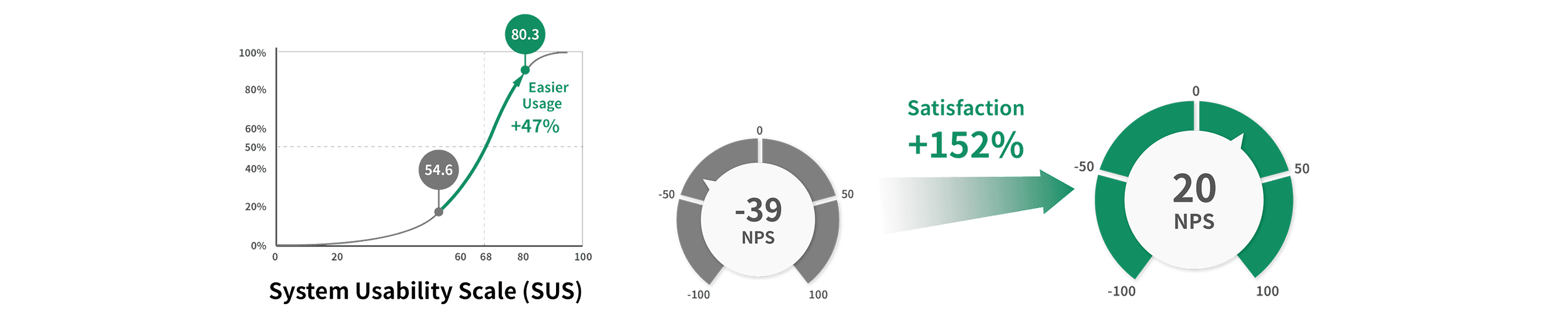
The Pet Registration Information System (PRIS) website was developed a long time ago to help government agencies and private organizations manage pet registration. Over time, various features were added, resulting in a disorganized site structure. We interviewed all other stakeholders to understand their tasks and the challenges they encountered. Then, we redesigned the website's UI layout and information architecture. Ultimately, we improved PRIS's NPS from -39 to 20 and the SUS score from 54.6 to 80.3.
Background
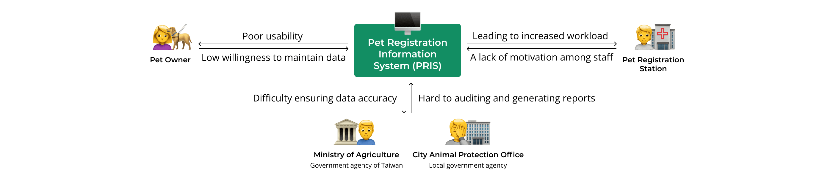
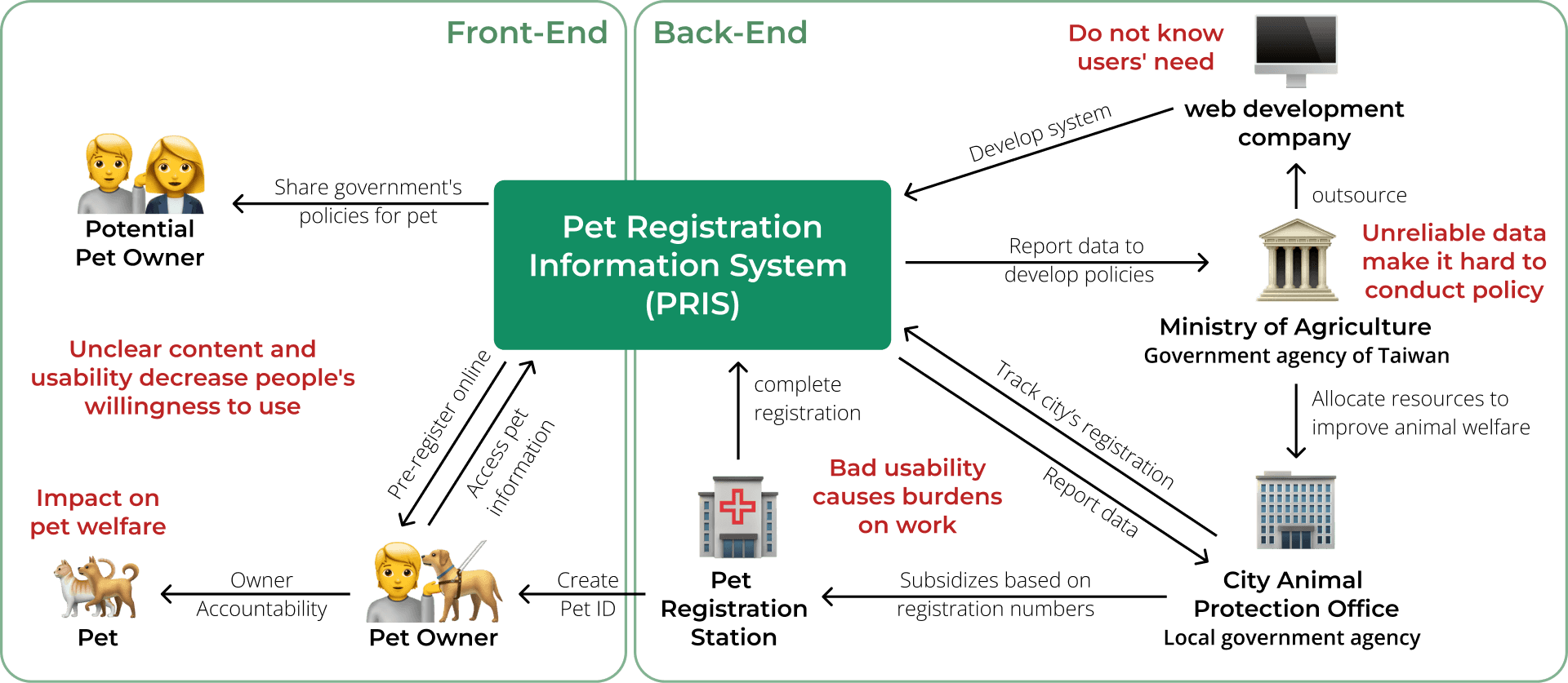
Pet Registration Information System (PRIS) is a website for pet management in Taiwan. The Taiwanese government uses this website to manage pet information. Pet owners can register their pets and record vaccination dates, while private organizations help the government manage data on pets and strays.
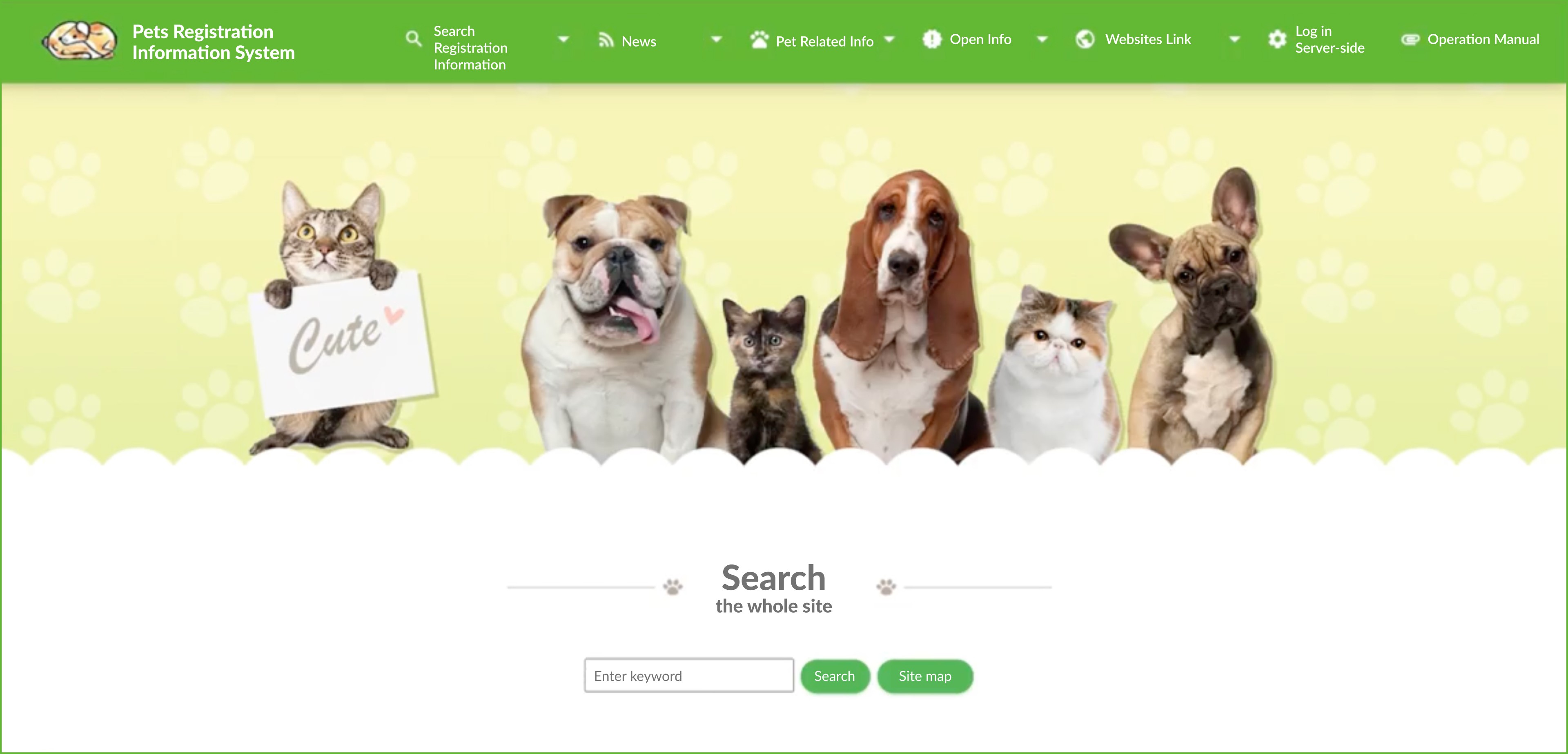
> The homepage of the website before the redesign
PRIS's poor usability had increased the workload of pet administrators, and meanwhile, pet owners were unable to complete the registration process and maintain data. We aimed to improve PRIS’s poor usability and disorganized structure through UX research and redesign.
> Website system mapping
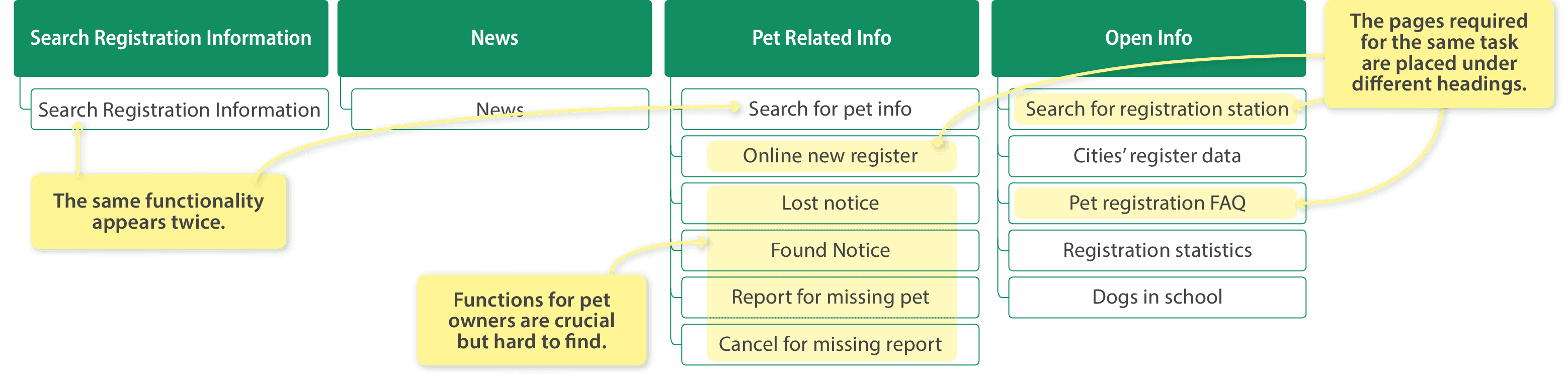
The unstructured addition of functions made the system operation very unintuitive and difficult to navigate. For instance, there were four same function buttons scattered across different areas of the interface, while similar functions were placed within different page categories.
> The sitemap of the website before the redesign
Despite the website's numerous usability issues, a more pressing concern was that it contained millions of entries about pets and stray dogs. Due to the confusing nature and inaccuracies of this information, it was unhelpful for policy evaluation, rendering the data essentially worthless.
👉 Recognizing these challenges, our team aimed to address them by conducting UX research and redesigning PRIS's user interface and information architecture.
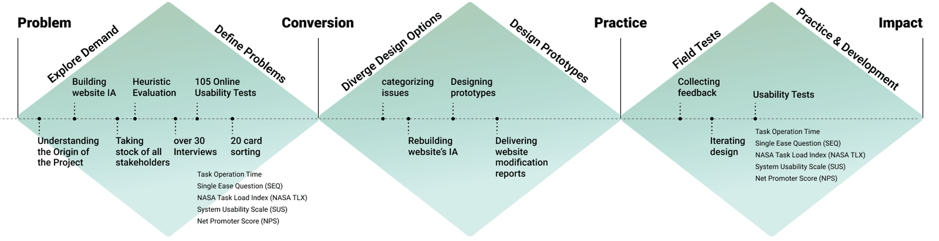
Problem Analysis
1. Interviewed the Supervisor
We interviewed the supervisor who had decision-making power over the website. This interview allowed us to gather his insights on the PRIS website and clarify its value and intentions, ensuring that the project goals aligned with the government's needs.
2. Reviewed the Entire Website
We began by reviewing the entire website, taking screenshots of each page. We used Miro to document the path of each function and highlighted the interruption points within these paths to ensure that we could pay special attention to these points during the interviews.
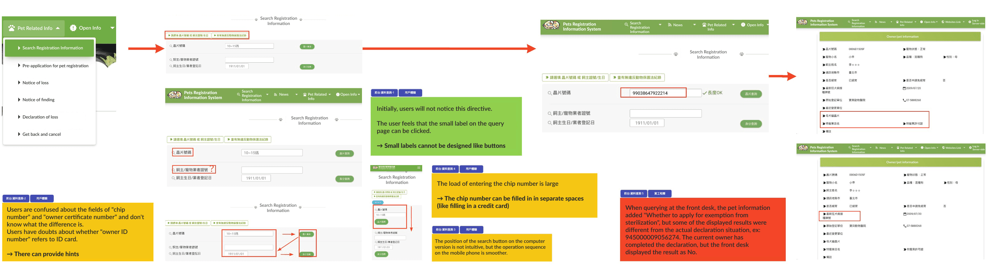
> One of the main features is the path record and encountered obstacles
3. Identified All Stakeholders
We asked the supervisor about the individuals using the website, and he provided several key roles. Following this, we repeated the same question after each interview to ensure our research covered all stakeholders and website users.
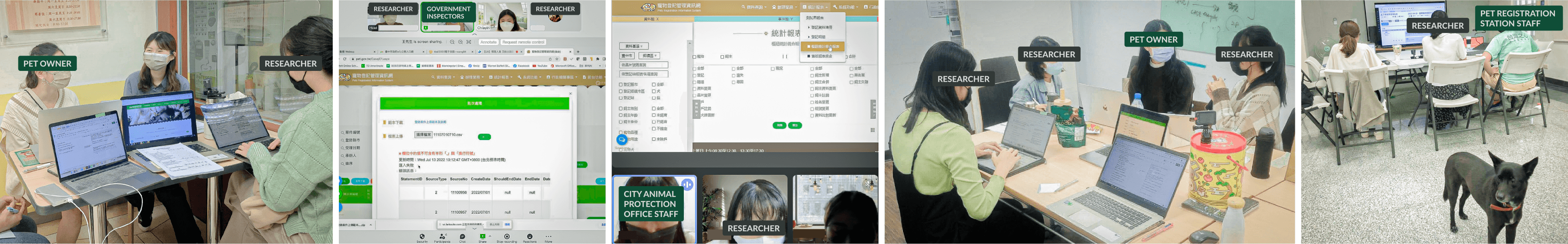
> Interviews
4. Reconstructed the Information Architecture
Through our interviews, we discovered that users found the website’s structure confusing, with some page names lacking intuitiveness. Many users struggled to navigate the site. Recognizing this critical issue, we conducted card sorting exercises to reorganize and clarify the information architecture.
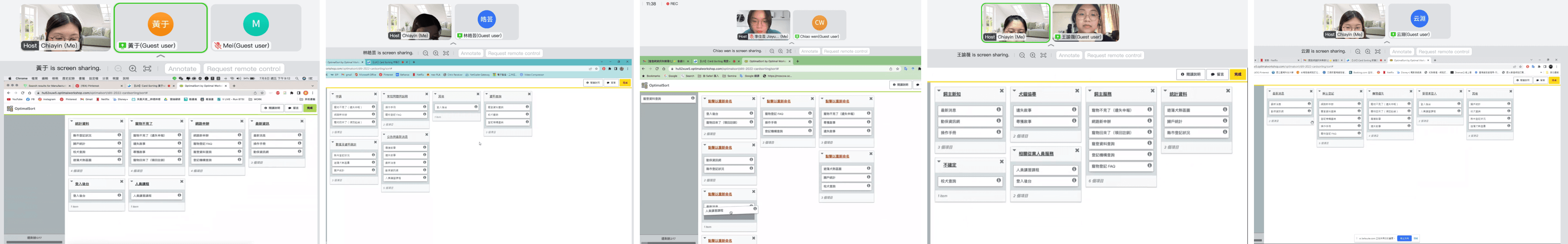
> Card sorting interviews
Key Challenges
1. Restrictions Due to Personal Data Regulations
Since the website contained sensitive owner information, our team was unable to use the real site for testing to comply with personal data protection laws. Instead, we had to rely on a separate testing system that differed in functionality from the official website and provided limited data. This made it challenging to simulate real-world scenarios accurately.
To overcome this, we provided users with mock data during interviews and required them to go through the full process. While observing their actions, we also asked them to share their past experiences and any problems they had encountered with the actual site.
2. Low Emphasis on Usability by the Development Company
The government had repeatedly reported usability issues to the website development company, but the company was slow to address them. To highlight the need for optimization, our team created a strategic report that included user quotes, clear priorities, and a redesigned version of the website. This report provided the engineers with a well-defined problem scope, insights into user frustrations, and a clear direction for improvement.
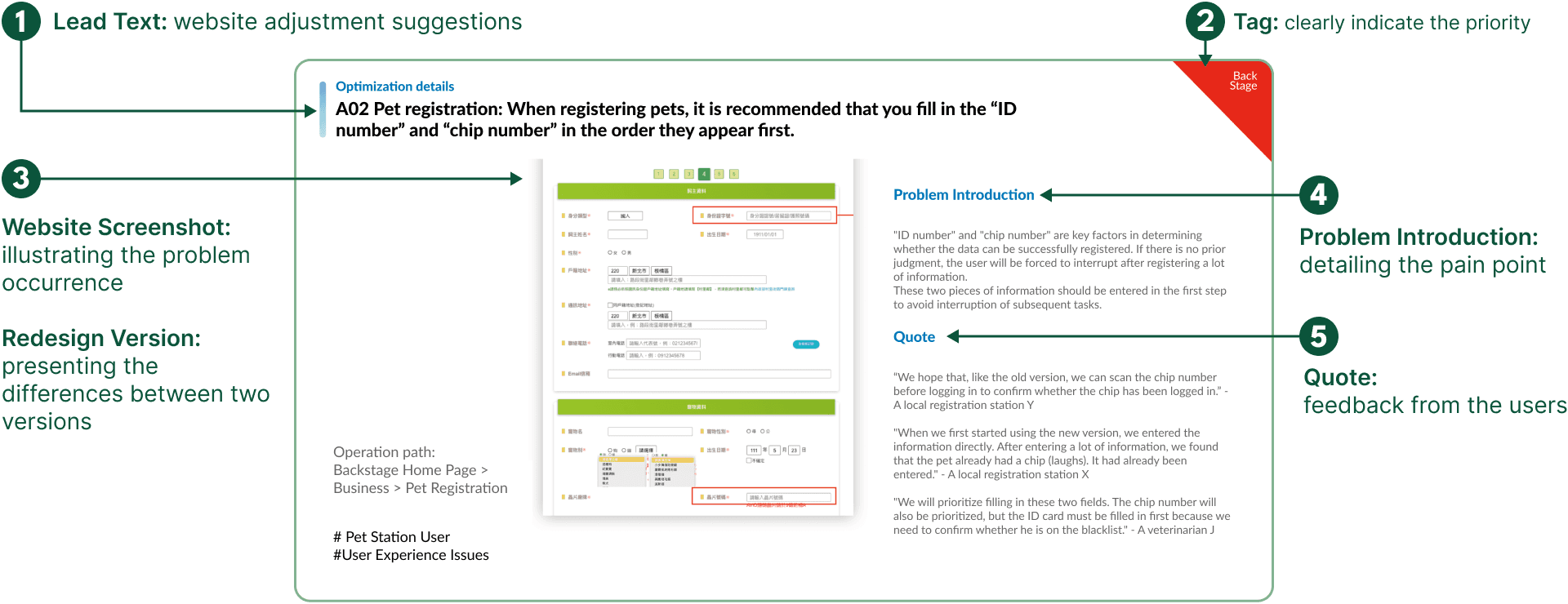
> User Experience Issues Report for the Website Development Company
3. Complex Stakeholders and Diverse User Needs
The website had to serve a wide range of users with different tasks, making the organization of its structure a fundamental but crucial challenge. To gather a comprehensive understanding of the website's required features and pain points, we conducted in-depth interviews with each user role to explore their primary tasks. We asked them to demonstrate their usual workflows, which helped us break down their tasks and prioritize them based on frequency and importance. We then identified pain points and unintuitive labels across the site’s functions. With this information, we reorganized the information architecture to help users navigate the website more efficiently and complete their tasks more effectively.
> Stakeholders
Outcome
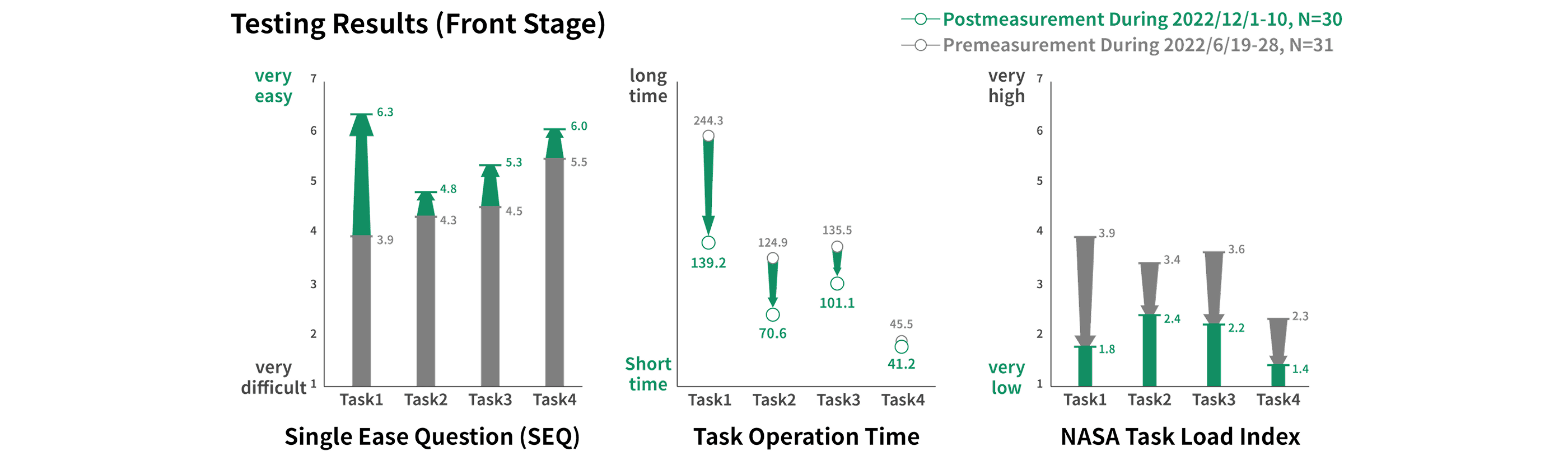
1. Boosting Usability and Stakeholder Satisfaction
Following the launch of the redesigned PRIS website, usability improved significantly, leading to higher satisfaction among all user groups, including pet owners, government agencies, and Pet Registration Stations.
> Testing Results
> SUS and NPS score
These enhancements not only boosted user satisfaction but also facilitated seamless information exchange among diverse stakeholders. This elevated the system’s overall value, encouraged public participation in pet registration, and enhanced data accuracy. Ultimately, these improvements supported better management and decision-making for future animal welfare policies.
2. Systematically Addressing Website Issues
Through our research, we identified 126 issues spanning user experience concerns, government regulations, workflow challenges, and back-end functionalities. Among these, 56 user experience-related issues were refined through collaborative discussions with multiple stakeholders to confirm their needs.
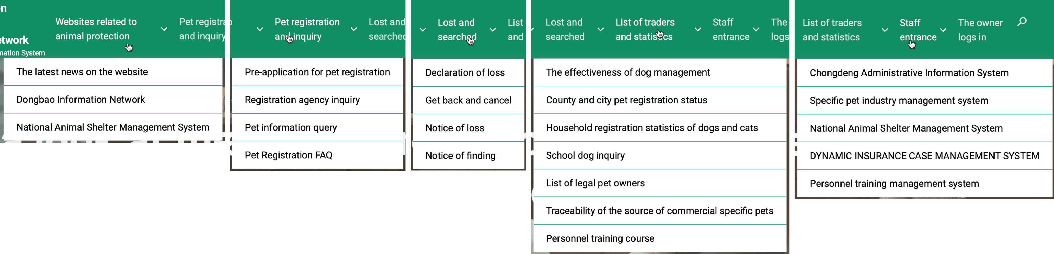
3. Reconstructing the Website’s Information Architecture
Our research revealed that users often felt confused by the website’s structure and page labels. To address this, we conducted 20 card-sorting sessions and accompanying analyses to redesign the Information Architecture.
> The information architecture of the website after the redesign
Personal Insight & Learning
1. Holistic communication can effectively and efficiently drive stakeholders forward.
Before our team got involved, there was no communication channel among the various stakeholders. This led to the government being unaware of the needs and pain points of the implementers, the website development company being unaware of the obstacles the website posed to many tasks, and pet owners not understanding the purpose of the website. Our team's role is to serve as the communication bridge among these stakeholders and guide them on the next steps.
2. Conveying user feedback to the web development company can effectively motivate them to invest time in enhancing the website's usability.
In our initial research, we found that website development companies prioritize efficiency, often overlooking the actual user experience. Our team aims to make engineers aware that their websites are hindering many tasks. To persuade the engineers to put more effort into improving website usability, we presented user feedback in our presentation.
3. Combining qualitative and quantitative research can effectively persuade governmental units and web development companies.
From the project's start, we focused on ways to validate website design improvements. This approach equipped our team with data when reporting to the Ministry of Agriculture and the website development company, proving the benefits of design optimization for the website. However, since data alone couldn't pinpoint where users faced obstacles during tasks, we used interviews to gain deeper insights into the actual user experiences.
© PRIS: Elevating Usability and Workflow for Government Services