Giftway: Reducing User Anxiety in the Gift-Giving Journey
Year
'23
Client
Course Project
Service
Product Development, Product Strategy, Qualitative Analysis, Quantitative Analysis, UX Research, UX Design, Figma
Gifting is an essential way to maintain social ties, but many people feel stressed about choosing the right gift because gifts carry complex values and meanings. Additionally, gift-giving is a massive market. Each holiday season, e-commerce marketers use various promotions to encourage people to make gift purchases. However, givers still struggle with selecting the right ones.
This project aims to help givers choose appropriate gifts, making the process easier through user research and design.
This project originated from a UXD course and evolved into a design thesis project, which I completed independently.
The Paradox of Choice in a $131B Market
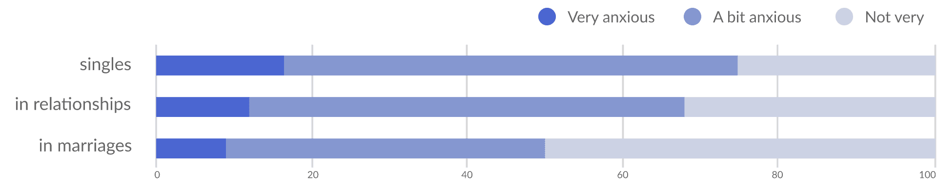
Gift-giving is a massive $131.3 billion industry, yet it is a major source of stress. My secondary research revealed a conflict: while people want to connect socially through gifts, over 60% of givers feel anxious about the process.
The core problem was uncertainty. Givers worry about the recipient's reaction and struggle to find "appropriate" gifts amidst generic marketing promotions. They didn't need more products; they needed confidence in their decision-making.
> Gift-giving Anxiety Survey
Designing for "Emotional Conveyors"
My goal was to design an e-commerce mobile app that reduces the cognitive load and anxiety of selecting a gift. I focused on a specific demographic: Recent Graduates. This group faces high pressure to maintain social bonds but often lacks the financial resources or experience to buy gifts confidently. I needed to move them from "anxious guessing" to "confident selection."
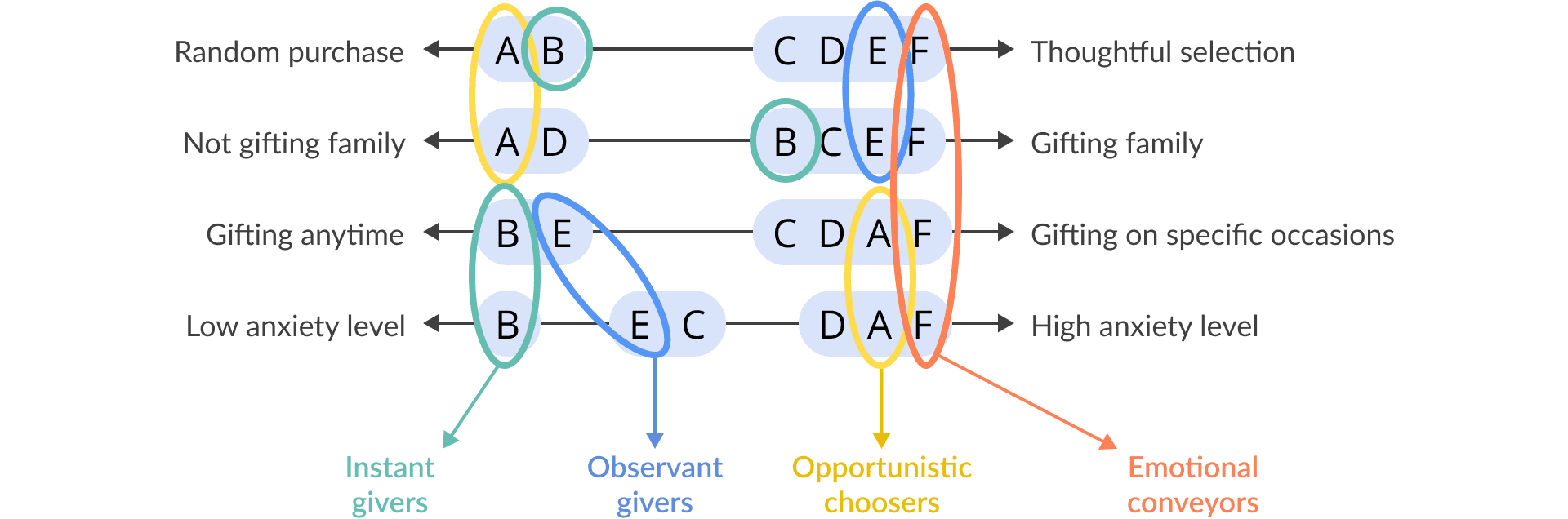
> User Segmentation
A Psychology-Driven Design Process
1. Deep-Dive User Research & Segmentation
I conducted 18 interviews to understand the psychology behind the purchase. I identified four distinct behaviors, but narrowed my target audience to two high-value personas:
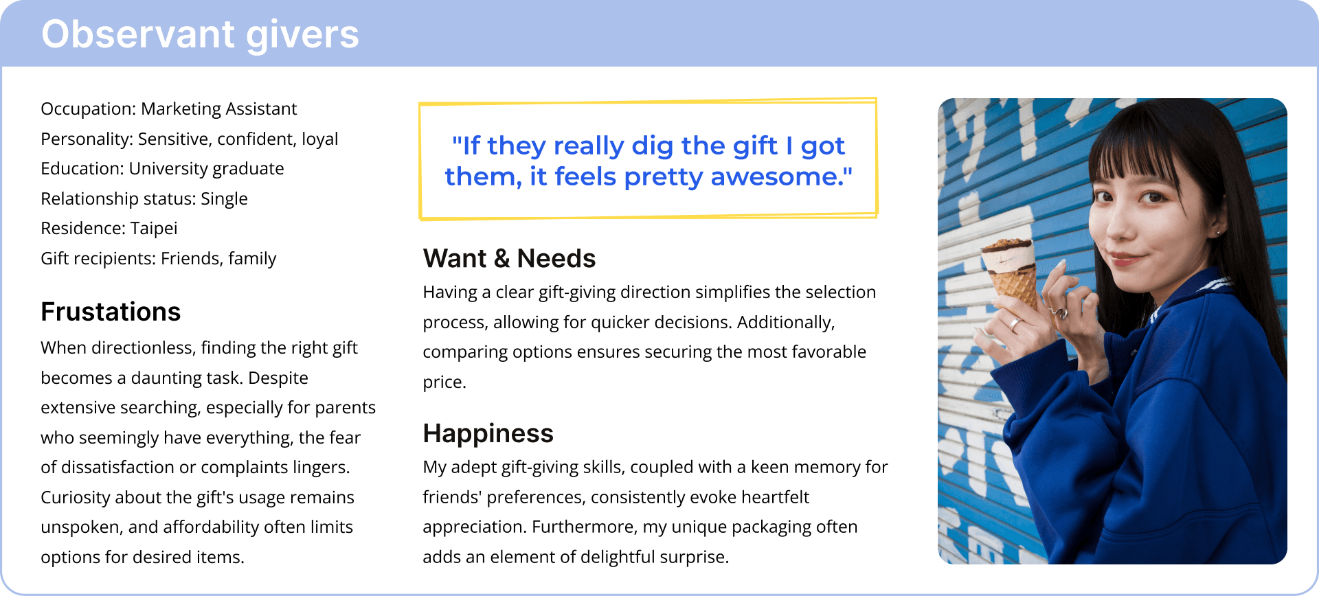
Observant Givers: Take gifting seriously and fear making a mistake.
Emotional Conveyors: Use gifts to express complex feelings.
(I excluded "Instant Givers" who buy randomly, as they don't experience the pain point).
> Persona - Observant Givers
2. Addressing Key Pain Points
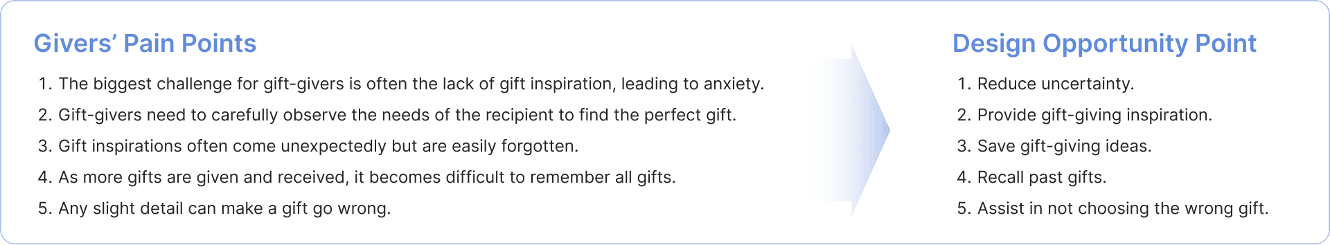
Users reported that inspiration is fleeting and details are easy to miss. I mapped these anxieties to design opportunities:
> Product features
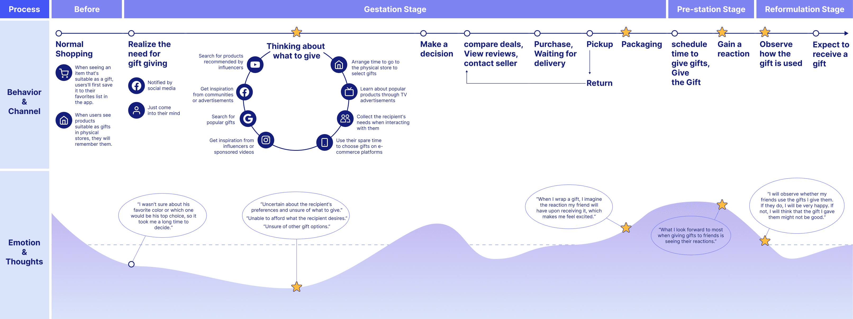
> User journey map
3. Strategic Information Architecture
I analyzed competitor apps and noticed they prioritized "shopping" over "thinking." I restructured the IA to guide the user through a journey of inspiration before the transaction.
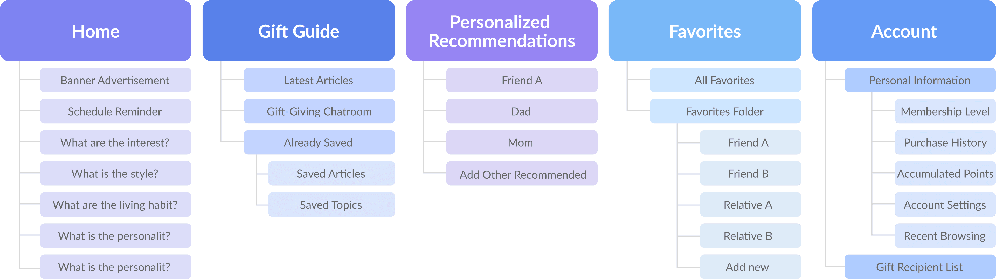
> Information architecture
4. Design Solutions
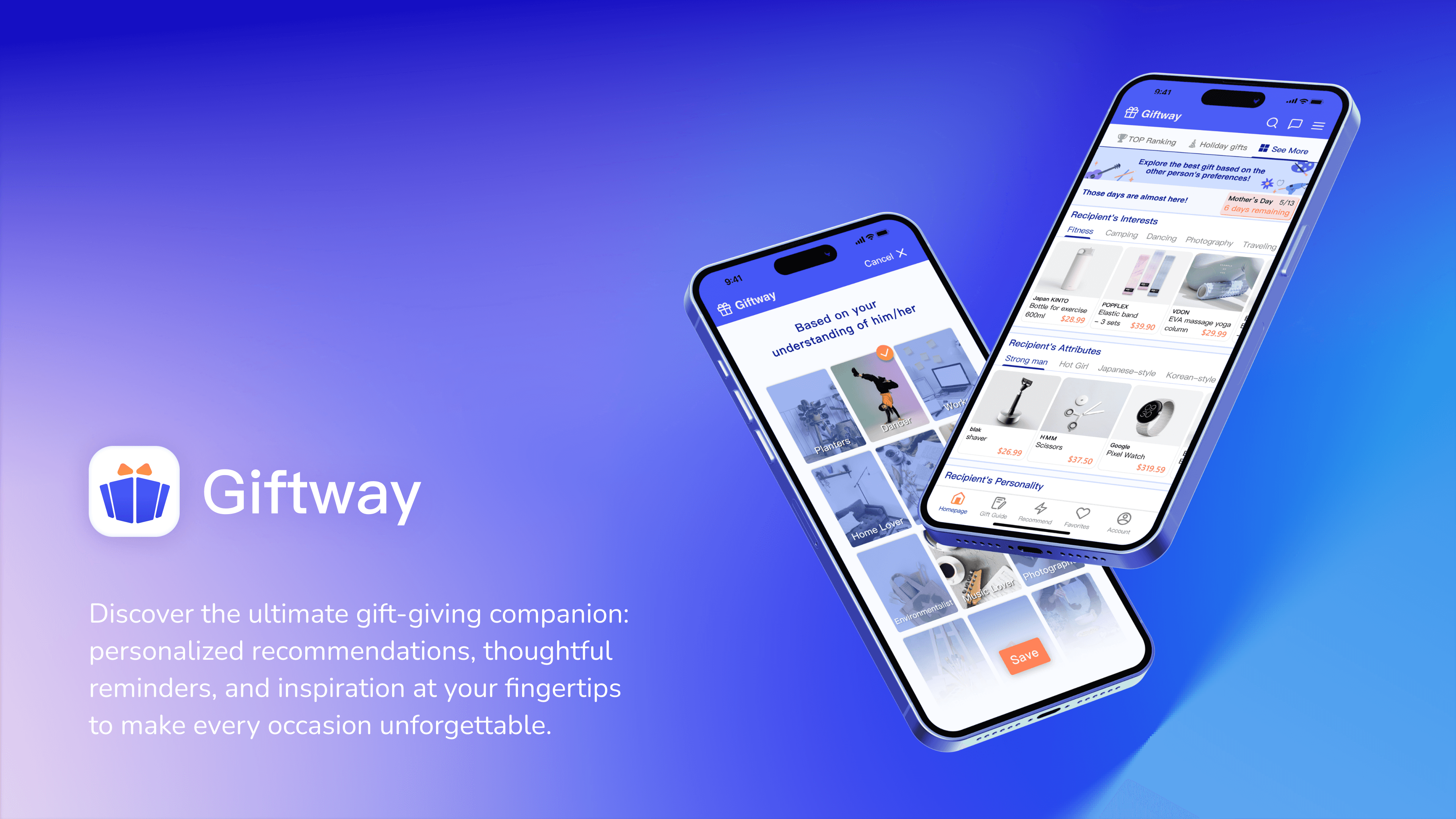
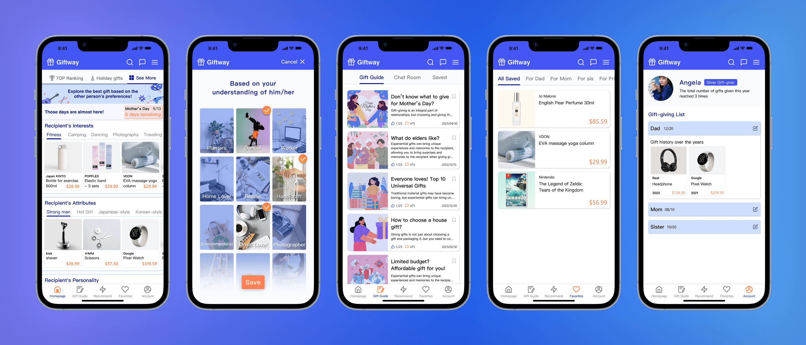
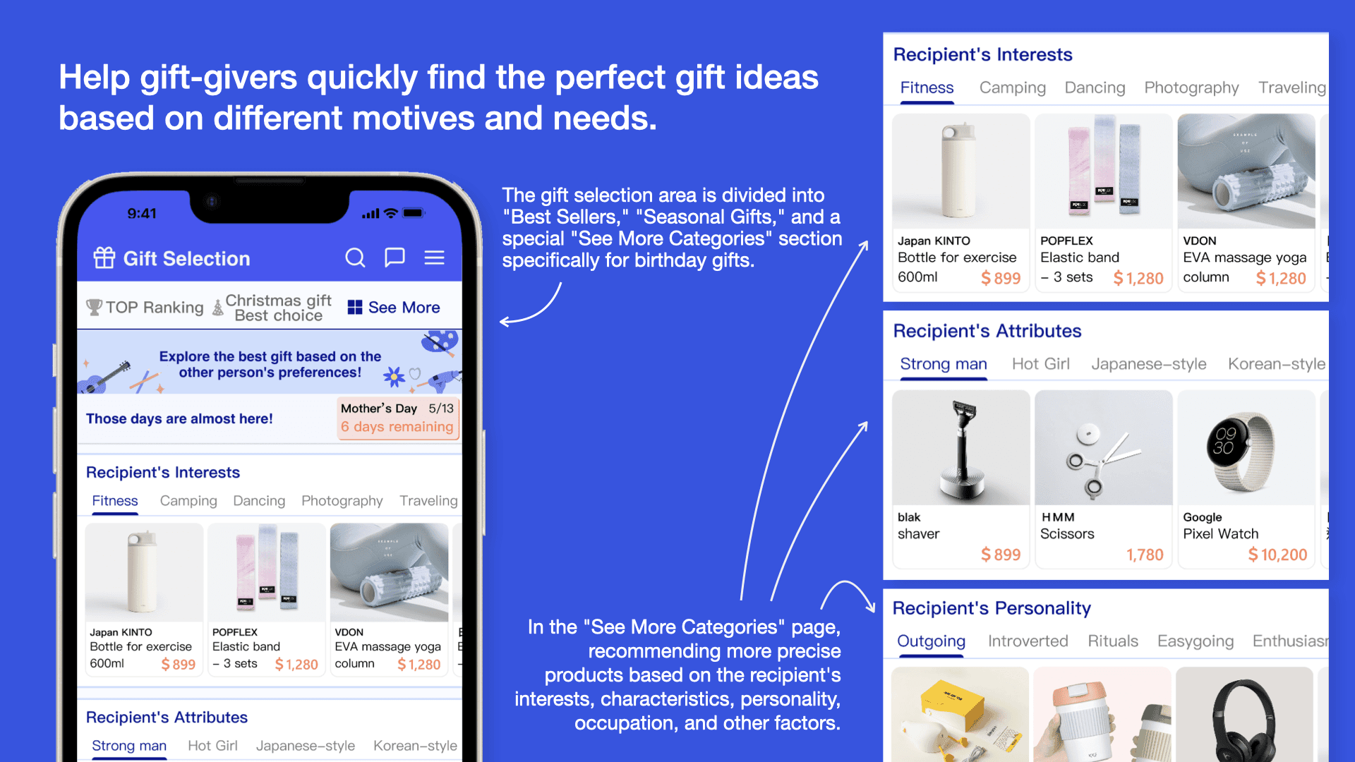
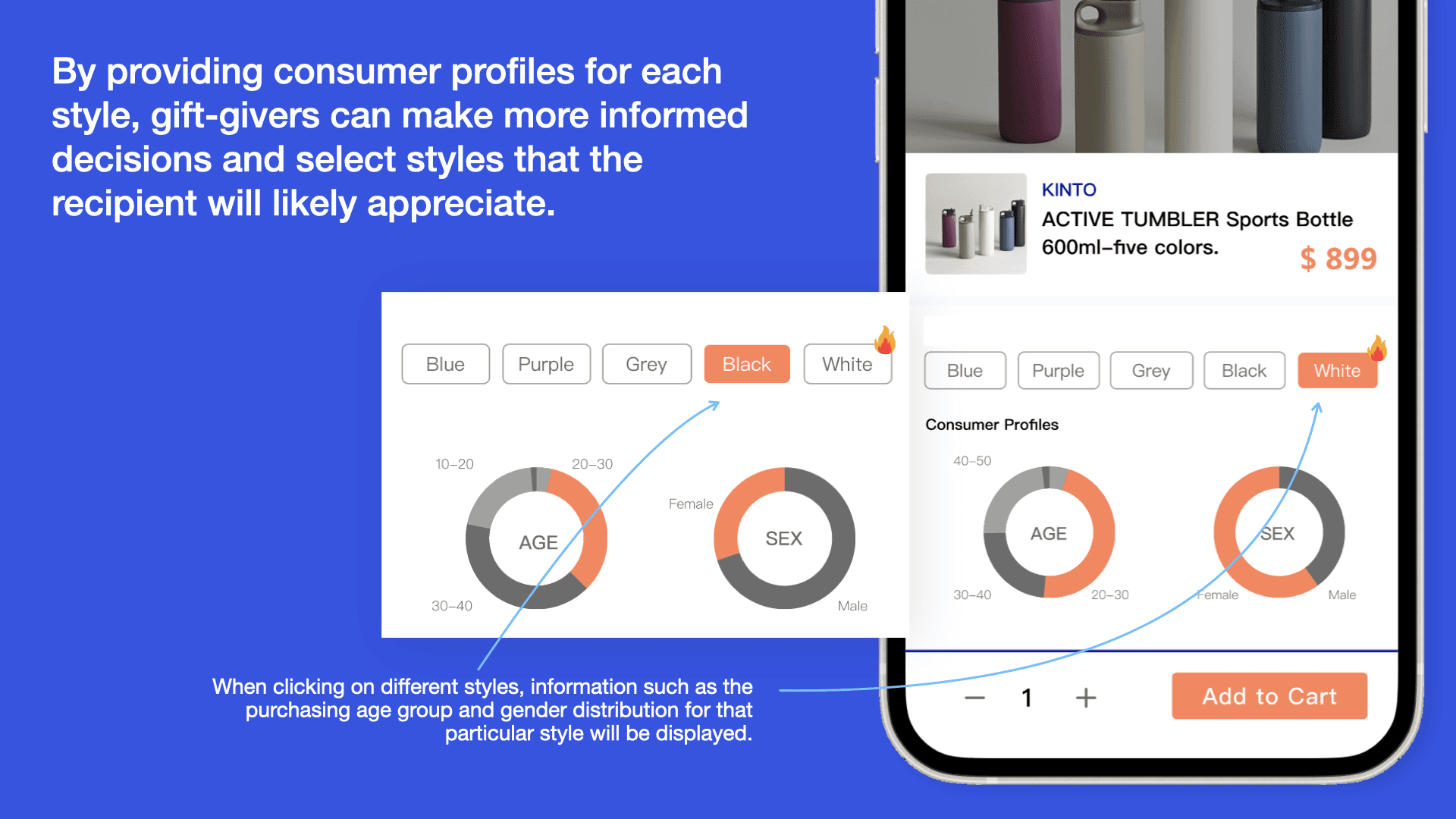
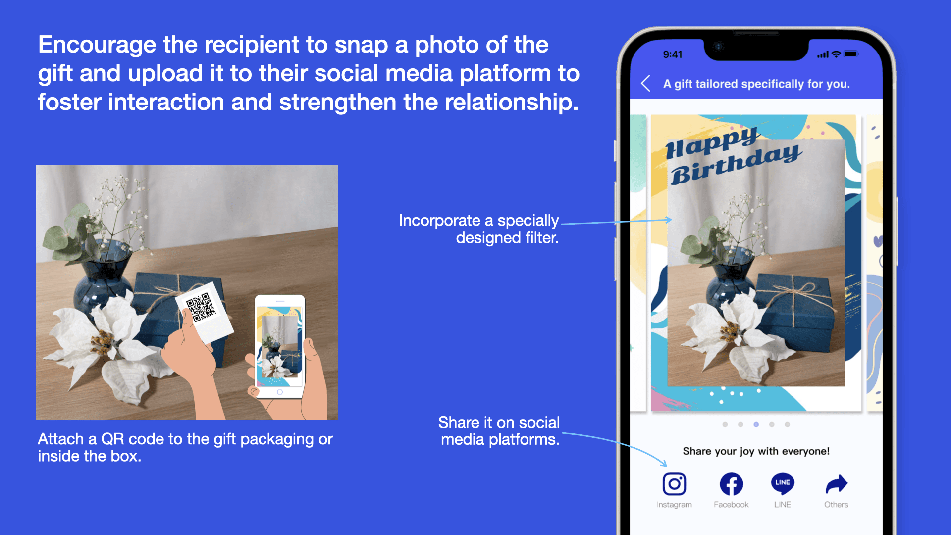
Based on the insights mentioned above, I then developed the app's five key features and information architecture. Additionally, I designed its logo, as well as the guidelines for colors and typography.
> Giftway app
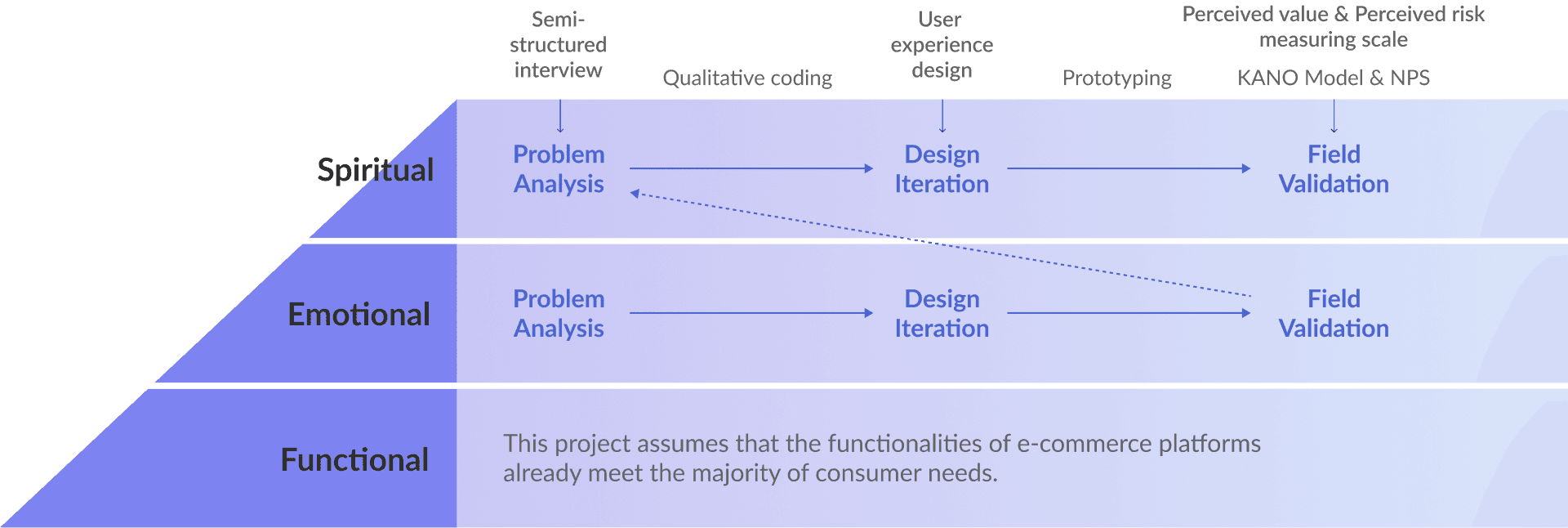
Increasing Value & Reducing Risk
I didn't just test if it "worked", I tested how it felt. I used a mixed-method approach (Quantitative + Qualitative):
KANO Model: To classify features based on customer satisfaction.
Perceived Value vs. Perceived Risk: To measure if the design actually reduced anxiety.
> Research and design process
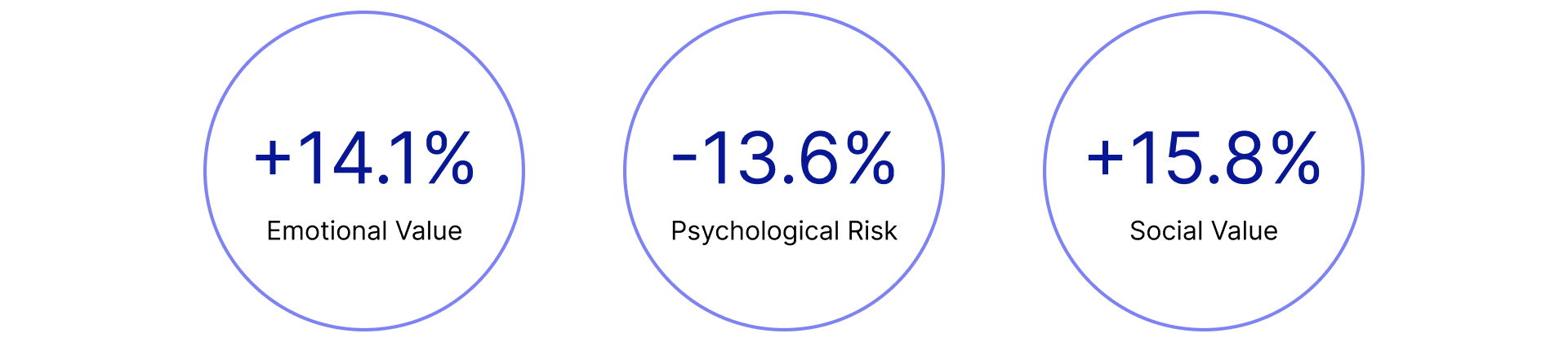
The design successfully shifted the user's mindset from anxious to excited.
14% Increase in Perceived Value: Post-test metrics showed a significant jump in how users valued the gifting experience compared to traditional platforms.
Reduced Social Risk: Qualitative feedback indicated users felt significantly more confident that their gift would be well-received.
> Perceived value and perceived risk outcome
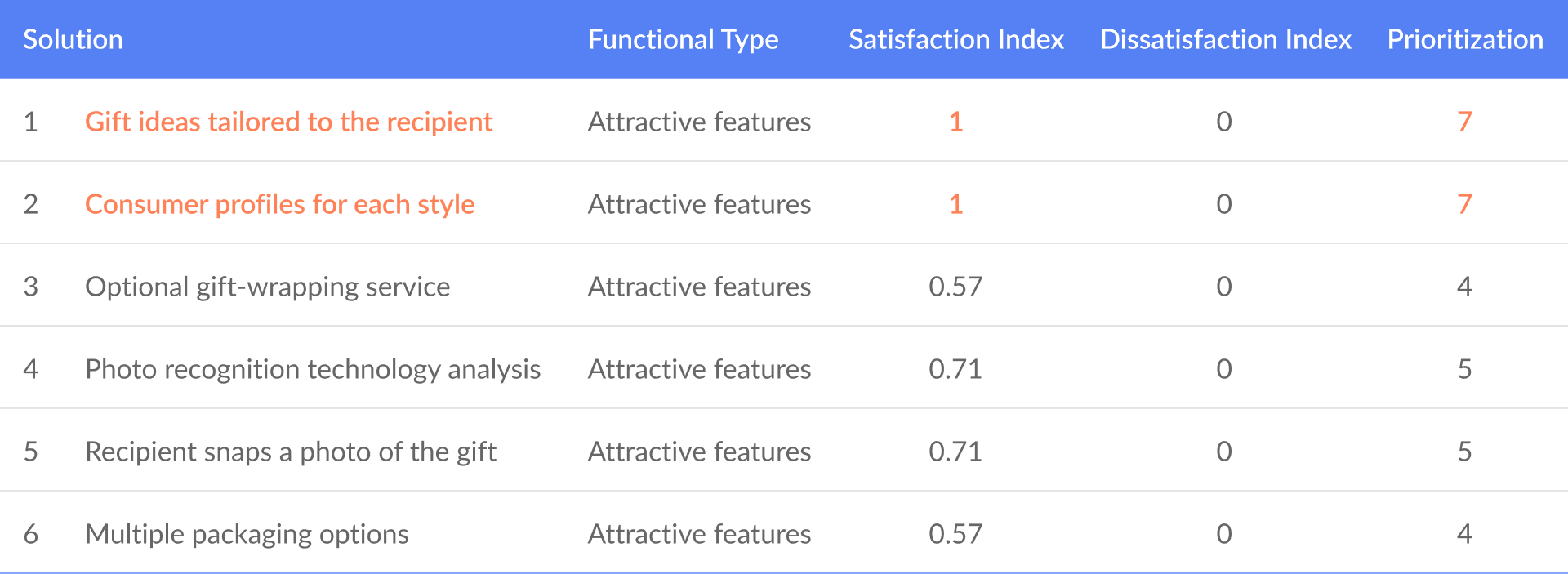
Validated Attractive Quality
According to the KANO analysis, the new features (like evidence-based inspiration) were classified as "Attractive Qualities".
It means they function as key differentiators that delight users.
> KANO Model: To classify features based on customer satisfaction.
Personal Learnings
1. Different expectations and emotional needs from typical users
Emotional and spiritual needs differ from regular shopping, motivating users to utilize the features provided by e-commerce platforms for different reasons.
2. Perceived value and risk in exploring emotions and spirituality
Integrating the three-diamond design process with perceived value/risk can effectively delve into respondents' emotional states and social/spiritual needs.
3. Meeting emotional and spiritual needs creates new competitive advantages
Currently, e-commerce platforms overlook emotional/spiritual needs. This research approach can effectively enhance value and reduce risk, helping e-commerce platforms seek a new competitive edge.
© Giftway: Reducing User Anxiety in the Gift-Giving Journey