From MVP to Ecosystem: Redesigning the Oscr AI Experience
Streamlining the research-to-publish workflow for global content creators through a three-tiered UX strategy.
My Role
Team
Company
Tools
Introduction
Evolving an AI MVP into a Professional Workflow Tool

What I did
I transformed ambiguous product requests into a structured design strategy by connecting user insights with business priorities.
Stakeholder Interviews
Conducted stakeholder interviews with the Founder (a power user) to align on long-term vision and clarify feature trade-offs.
Qualitative Data Analysis
Synthesized hundreds of support emails to identify systemic workflow friction rather than isolated feature requests.
Roadmap Survey Analysis
Analyzed 100+ roadmap survey responses and translated voting data into actionable prioritization insights.
Remote Contextual Inquiry
Led remote contextual inquiry sessions across Mexico, China, and Japan, uncovering pre-app research behaviors that directly informed the redesign of the Discovery workflow.
End-to-End Ownership
I bridged user insights and product strategy to execution, translating research findings into clear design directions and final UI solutions while ensuring alignment with business goals.
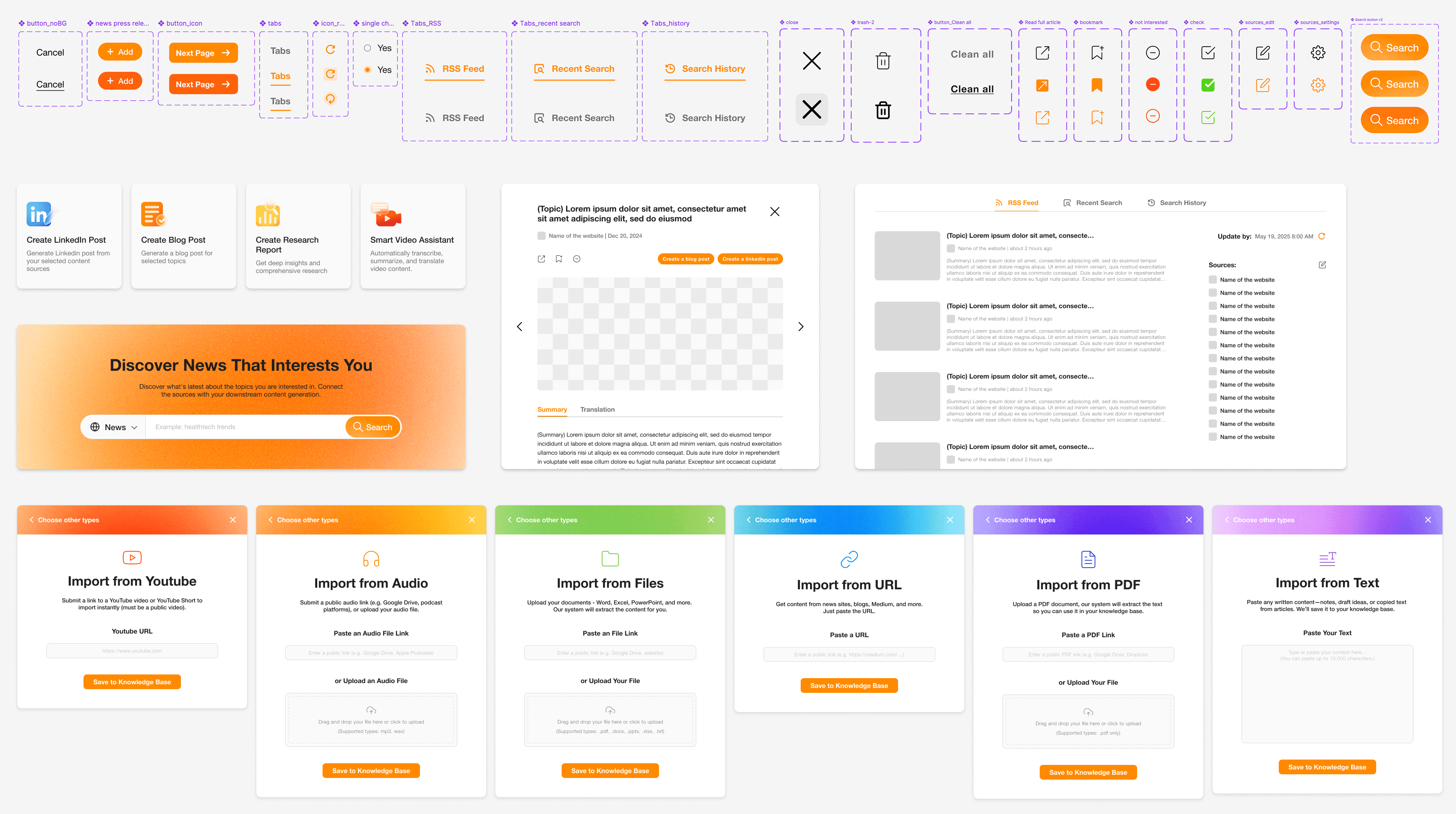
Design Solutions
# 1
One of the biggest challenges was that users didn’t feel in control of the AI output.
Made AI outcomes more predictable, transparent, and user-directed

Guided Generation

Verifiable Outputs

Modular Inputs
# 2
Simplified User Flow & Information Architecture for Clarity

Beyond individual features, one of the biggest decisions I made was to reorganize the entire product around a clear end-to-end workflow.
# 3
Reduced Cognitive Load Through Visual Hierarchy

Prioritizing what matters through progressive disclosure.
# 4
Elevated Brand Identity to Build Professional Trust
Redesigning the visual identity to match B2B expectations.

Results and Impact
Launched a Research-Driven Feature in 3 Weeks
Partnered with PM and engineers to ship RSS as a core workflow within three weeks, aligning scope, technical constraints, and user priorities through rapid iteration.
Built a Scalable Design Foundation for Long-Term Growth
Established a modular visual system and clearer information architecture, strengthening product trust and ensuring consistency as the platform scales.

Conclusion
Designing for Scalability under Technical Constraints
This project was a masterclass in balancing user desires with technical reality. For instance, while users requested "auto-updating" articles, technical constraints made this unfeasible for the sprint. Instead of ignoring this, I designed the UI layout to be "future-proof," reserving space for this feature to be easily added in later versions. This experience taught me that great UX isn't just about solving today's problems, but laying the groundwork for tomorrow's growth.
Read more


